Testing in Practice · Part 10
Usability testing (hands-on): a heuristic review, five users, and the form that threw away a correct address
ProvaLab team · · 13 min read
Software can pass every functional test and still lose customers. The form works, but nobody can tell which box is the pincode. The error is correct, but it doesn't say which field. The button is there, but it's 34 pixels tall and right next to a huge Cancel. Usability testing finds these problems: not "does it work?", but "can people use it, easily, without help?"
The ISO standard for usability, ISO 9241-11, defines it with three measures:
- Effectiveness: can people complete the task?
- Efficiency: how much time and effort does it take?
- Satisfaction: how do they feel about it?
This post shows the two main ways to find usability problems, on a FoodNow add a delivery address form for phones:
- A heuristic review: an expert checks the design against well-known rules. We did this for real, with Playwright filling in the form on a phone-sized screen and measuring what can be measured.
- A usability test with users: you watch real people try real tasks. That needs real people. We show how to plan and run one. The questionnaire answers in Step 6 are an example, and we say so where they appear.
Usability testing vs UAT
Part 9 was user acceptance testing. They're often confused:
| Usability testing | User acceptance testing | |
|---|---|---|
| Question | Can people use it easily? | Does it fit our work? Do we accept it? |
| When | Early and often, even on sketches | Near the end, on the finished build |
| Who | Representative users, often new to the product | The users or business who'll accept it |
| Result | A list of problems, by severity | A decision: accept or not |
Usability testing is cheapest early, on a sketch or prototype, when changing the design costs nothing. By UAT, the same finding costs a release.
The form
The add-address form, version 1. It's a small FastAPI app that renders this HTML:
<h1>Add address</h1>
<form method="post" action="/address">
  <a class="loc" href="#">Use current location</a>
  <input name="flat" placeholder="Flat / house no.">
  <input name="street" placeholder="Street and area">
  <input name="pincode" placeholder="Pincode">
  <input name="phone" placeholder="Phone for the rider">
  <div class="row">
    <button class="save">Save</button>
    <button class="cancel" type="button">Cancel</button>
  </div>
</form>
And the server-side check:
@app.post("/address", response_class=HTMLResponse)
def save(flat: str = Form(""), street: str = Form(""), pincode: str = Form(""), phone: str = Form("")):
    if not (flat and street and re.fullmatch(r"\d{6}", pincode) and re.fullmatch(r"\d{10}", phone)):
        return form("Error: invalid input")
    return page(f'<h1>Address saved</h1><p id="saved">{flat}, {street}, {pincode}</p>')
Every functional test you'd write for this passes: valid input saves, invalid input is refused. Now look at it as a customer would.
Step 1: Fill it in like a customer
This Playwright script opens the form on a phone-sized screen and fills it in the way a person in India would, including the phone number written the usual way, with the country code and a space. Save it as review.py (you need pip install playwright==1.64.0 and playwright install chromium):
import sys

from playwright.sync_api import sync_playwright

URL, SHOTS = sys.argv[1], sys.argv[2]

with sync_playwright() as p:
    browser = p.chromium.launch()
    page = browser.new_context(viewport={"width": 412, "height": 915}, device_scale_factor=2,
                               is_mobile=True, has_touch=True, locale="en-IN").new_page()
    page.goto(URL)

    # 1. Fill it in as a customer would, including the phone number as people write it.
    fields = page.locator("input")
    values = ["Flat 4B, Lotus Apartments", "14th Cross, Indiranagar", "560038", "+91 98765 43210"]
    for f, v in zip(fields.all(), values):
        f.fill(v)
    page.screenshot(path=f"{SHOTS}/2-filled.png")
    page.get_by_role("button", name="Save").click()
    page.wait_for_load_state()
    page.screenshot(path=f"{SHOTS}/3-after-save.png")
    print("after Save:", page.locator("h1").inner_text(), "|",
          page.locator(".err, [role=alert], #saved").all_inner_texts())
    print("values kept:", [f.input_value() for f in page.locator("input").all()])

    # 2. Labels and keyboards.
    page.goto(URL)
    for f in page.locator("input").all():
        label = f.evaluate("e => e.labels.length ? e.labels[0].innerText : null")
        print(f"field {f.get_attribute('name')!r}: label={label!r} placeholder={f.get_attribute('placeholder')!r} "
              f"type={f.get_attribute('type')!r} inputmode={f.get_attribute('inputmode')!r} "
              f"autocomplete={f.get_attribute('autocomplete')!r}")

    # 3. Tap targets: WCAG 2.2 asks for at least 24x24 CSS px; Android and iOS guides say 48 and 44.
    for el in page.locator("a, button, input").all():
        box = el.bounding_box()
        name = (el.inner_text() or el.get_attribute("name") or "").strip()
        flag = "  < 24px" if min(box["width"], box["height"]) < 24 else ("  < 44px" if min(box["width"], box["height"]) < 44 else "")
        print(f"target {name!r}: {box['width']:.0f} x {box['height']:.0f}{flag}")
    browser.close()
The output, on version 1:
after Save: Add address | ['Error: invalid input']
values kept: ['', '', '', '']
field 'flat': label=None placeholder='Flat / house no.' type=None inputmode=None autocomplete=None
field 'street': label=None placeholder='Street and area' type=None inputmode=None autocomplete=None
field 'pincode': label=None placeholder='Pincode' type=None inputmode=None autocomplete=None
field 'phone': label=None placeholder='Phone for the rider' type=None inputmode=None autocomplete=None
target 'Use current location': 114 x 17  < 24px
target 'flat': 372 x 44
target 'street': 372 x 44
target 'pincode': 372 x 44
target 'phone': 372 x 44
target 'Save': 62 x 34  < 44px
target 'Cancel': 300 x 53
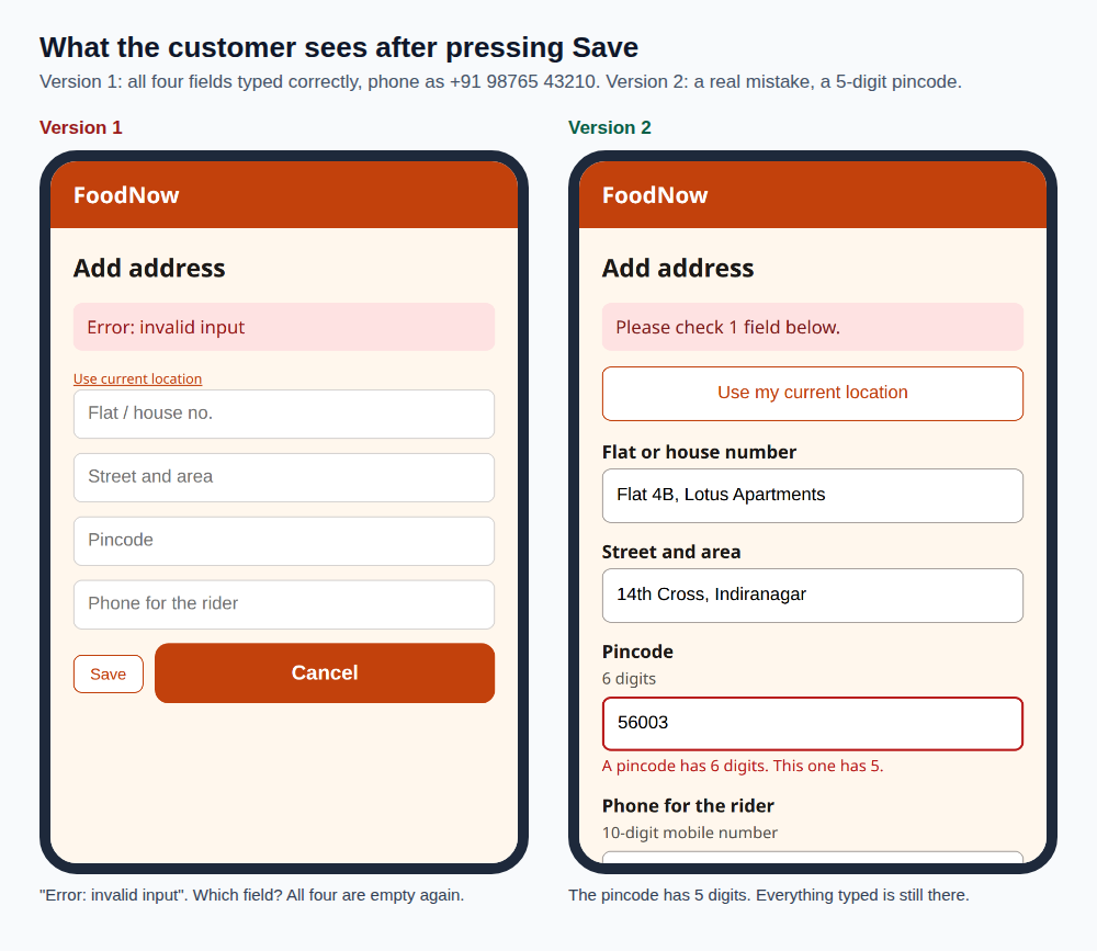
The address was correct. The phone number was correct too, written the way most people in India write it. The form said "Error: invalid input" and emptied all four fields. A customer on a phone has to type the whole address again, without knowing what was wrong. Many won't. They'll order somewhere else.
A functional test with 9876543210 passes. Only a test that uses the input real people type finds this.
Step 2: The heuristic review
A heuristic review (or heuristic evaluation) checks a design against a short list of rules of thumb. The best known are Jakob Nielsen's 10 usability heuristics, first published in 1994. Two or three reviewers check the design separately, then combine their lists. It's quick and cheap, and it needs no users.
What we found on version 1, using the run above and the screenshots:
| # | Problem | Heuristic | Severity |
|---|---|---|---|
| 1 | A correct phone number, +91 98765 43210, is refused |
Flexibility; error prevention | Critical |
| 2 | Every field is wiped after an error | Error prevention; user control | Critical |
| 3 | "Error: invalid input" doesn't say which field or why | Help users recognise, diagnose and recover from errors | Major |
| 4 | Placeholders are the only labels. Once a field is filled, nothing says what it is (see "filled" below) | Recognition rather than recall | Major |
| 5 | Cancel is the big, bright button, Save is small and pale, side by side | Error prevention; consistency with platform conventions | Major |
| 6 | "Use current location" is a 17-pixel-tall text link | Flexibility; WCAG 2.5.8 target size | Minor |
| 7 | Pincode and phone open the full letter keyboard, and nothing helps the browser autofill | Efficiency | Minor |
| 8 | Required fields and formats aren't stated before the customer types | Error prevention | Minor |
We used three severity levels: critical stops people from finishing, major causes real trouble or errors, minor slows them down or annoys them. (Nielsen's own scale has five, from 0 to 4, but the idea is the same.)
Notice that several of these are also accessibility failures. A placeholder disappears as soon as you type, so anyone who loses track has nothing to go back to, and WCAG asks for visible labels (success criterion 3.3.2). A 17-pixel link is hard to tap for anyone with shaky hands. Good usability and accessibility overlap a lot.
Step 3: Fix, and run the same checks
Version 2 changes the form, not the business rules:
FIELDS = [  # name, label, hint, extra attributes
    ("flat", "Flat or house number", "", 'autocomplete="address-line1"'),
    ("street", "Street and area", "", 'autocomplete="address-line2"'),
    ("pincode", "Pincode", "6 digits", 'inputmode="numeric" autocomplete="postal-code" maxlength="6"'),
    ("phone", "Phone for the rider", "10-digit mobile number", 'type="tel" autocomplete="tel"'),
]


def phone_digits(raw: str) -> str:
    d = re.sub(r"\D", "", raw)
    if len(d) == 12 and d.startswith("91"):
        d = d[2:]
    elif len(d) == 11 and d.startswith("0"):
        d = d[1:]
    return d
- Visible labels and hints above every field, linked with
forandaria-describedby. - Accept the formats people use. Spaces,
+91and a leading0are removed before the 10-digit check. - Keep what was typed. On an error, the form comes back with every value.
- Say what's wrong, next to the field. "A pincode has 6 digits. This one has 5." And a summary at the top with
role="alert", so screen readers announce it. - One clear primary action. "Save address" is full width and bright. Cancel is a plain link below it.
- Right keyboards.
inputmode="numeric"for the pincode,type="tel"for the phone, andautocompleteso the browser can fill the address. - Tap targets of at least 48 pixels.
The same script, on version 2:
after Save: Address saved | ['Flat 4B, Lotus Apartments, 14th Cross, Indiranagar, 560038. The rider will call 9876543210.']
values kept: []
field 'flat': label='Flat or house number' placeholder=None type=None inputmode=None autocomplete='address-line1'
field 'street': label='Street and area' placeholder=None type=None inputmode=None autocomplete='address-line2'
field 'pincode': label='Pincode' placeholder=None type=None inputmode='numeric' autocomplete='postal-code'
field 'phone': label='Phone for the rider' placeholder=None type='tel' inputmode=None autocomplete='tel'
target 'Use my current location': 372 x 48
target 'flat': 372 x 48
target 'street': 372 x 48
target 'pincode': 372 x 48
target 'phone': 372 x 48
target 'Save address': 372 x 52
target 'Cancel': 372 x 48
The address saves (values kept is empty because the page now shows the confirmation instead of the form). And with a real mistake, a 5-digit pincode:
alert: Please check 1 field below.
pincode error: A pincode has 6 digits. This one has 5.
values kept: ['Flat 4B, Lotus Apartments', '14th Cross, Indiranagar', '56003', '+91 98765 43210']
Step 4: Why test with users at all?
A heuristic review found eight problems in a few minutes. Why go further?
Because reviewers aren't users. They know what a pincode is, they read every word, and they don't use the app on a crowded bus with one hand. Users find problems no rule predicts: a word they don't understand, a step they expected and didn't get, a field they fill with something nobody imagined. In our form, a user might type their building name in the flat field and leave the street empty, or expect "Use my current location" to fill everything. You only learn that by watching.
So use both. The review clears the obvious problems cheaply, so the users' time is spent on the ones only they can find.
Step 5: How many users? Usually five, then five more
The famous answer is five. It comes from Jakob Nielsen and Tom Landauer's 1993 research: if a usability problem affects a share L of users, the chance that at least one of n test users runs into it is 1 − (1 − L)ⁿ. In their projects, a typical problem affected about 31% of users. This script works it out:
"""Share of usability problems found by n test users: 1 - (1 - L)^n."""
for L, label in [(0.31, "a typical problem (L = 31%)"), (0.10, "a problem 1 user in 10 hits")]:
    print(label)
    for n in (1, 2, 3, 5, 8, 15):
        print(f"  {n:>2} users: {1 - (1 - L) ** n:6.1%}")
a typical problem (L = 31%)
   1 users:  31.0%
   2 users:  52.4%
   3 users:  67.1%
   5 users:  84.4%
   8 users:  94.9%
  15 users:  99.6%
a problem 1 user in 10 hits
   1 users:  10.0%
   2 users:  19.0%
   3 users:  27.1%
   5 users:  41.0%
   8 users:  57.0%
  15 users:  79.4%
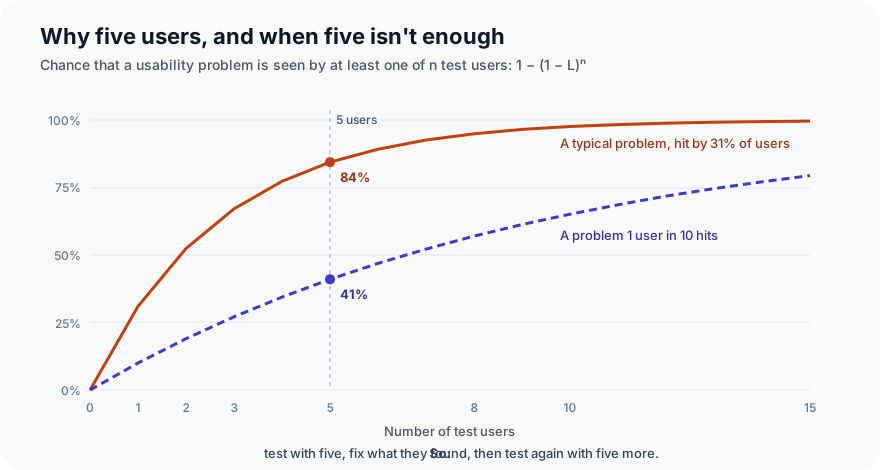
Five users find about 84% of the common problems. But a problem that only 1 user in 10 hits is found just 41% of the time. That's why the advice is five users, fix, then five more, not "five users and done". Each round finds the problems that are left. And if you have very different groups of users, such as customers and delivery riders, test about five from each group.
Step 6: Run the sessions
A usability session takes 30 to 60 minutes, one user at a time:
- Welcome them, and say what's being tested. "We're testing the app, not you. If something's confusing, that's what we need to know."
- Give a realistic task, not instructions. "You've just moved to a new flat in Indiranagar. Add it as your delivery address." Not "tap Add address, then type in the first box".
- Ask them to think aloud, and stay quiet. Don't help, don't explain, don't defend the design. If they ask, say "what would you do if I weren't here?"
- Watch what they do, not only what they say. Hesitations, wrong taps, re-typing, looking for something.
- Measure each task: completed or not, time taken, and errors.
- End with a short questionnaire, usually the System Usability Scale.
The System Usability Scale (SUS), created by John Brooke in 1986, is ten statements that users rate from 1 (strongly disagree) to 5 (strongly agree), such as "I thought the system was easy to use" and "I found the system unnecessarily complex". Odd-numbered statements are positive and even-numbered ones are negative, and the score runs from 0 to 100. This script scores it:
"""Score the System Usability Scale (SUS): ten statements, each answered 1 (strongly disagree) to 5 (strongly agree)."""
import csv
import sys


def sus(answers: list[int]) -> float:
    assert len(answers) == 10 and all(1 <= a <= 5 for a in answers)
    odd = sum(a - 1 for a in answers[0::2])   # statements 1,3,5,7,9 are positive
    even = sum(5 - a for a in answers[1::2])  # statements 2,4,6,8,10 are negative
    return (odd + even) * 2.5


rows = list(csv.reader(open(sys.argv[1])))[1:]
scores = []
for name, *answers in rows:
    s = sus([int(a) for a in answers])
    scores.append(s)
    print(f"{name:<14} {s:5.1f}")
print(f"{'average':<14} {sum(scores) / len(scores):5.1f}  (68 is about average across many studies)")
The answers below are an example, written for this post to show how the scoring works. They are not from real users. Five people on version 1, and five different people on version 2:
--- v1 (example answers)
P1              55.0
P2              70.0
P3              35.0
P4              60.0
P5              75.0
average         59.0  (68 is about average across many studies)
--- v2 (example answers)
P6              82.5
P7              87.5
P8              72.5
P9              90.0
P10             75.0
average         81.5  (68 is about average across many studies)
Two things about SUS. First, the score is not a percentage: 68 is roughly average, based on hundreds of published studies, so 59 is below average, not "59% usable". Second, with five people per version the spread is wide (35 to 75 on version 1), so treat it as a signal to compare rounds, not a precise measurement. The problems you watched people hit matter more than the number.
Step 7: Report what you found
A usability report is short and goes to the people who'll fix things:
- The tasks, and how many people completed each one.
- Each problem: what happened, how many users hit it, its severity, and a screenshot or short clip.
- What worked well, so nobody "fixes" it.
- Recommendations, most severe first.
Keep it to problems you saw. "Three of five users typed their phone with +91 and lost the whole form" moves a team. "Users may find validation unclear" doesn't.
Common mistakes
- Testing with colleagues. They know the product and the words. Recruit people like your real users.
- Helping during the session. The moment you point, you've lost the finding.
- Asking "do you like it?" People are polite. Watch what they do instead.
- Testing too late. A usability finding on a sketch costs an eraser. On a finished release it costs a sprint.
- One round of five, then done. Five users miss many rarer problems. Fix, then test again.
- Only reviewing, never watching. A heuristic review finds the obvious problems. Users find the rest.
- Testing on a laptop for an app people use on phones. Use the real device, the real network, the real situation.
What's next
In Part 11 of Testing in Practice we write your first Selenium test: Selenium WebDriver with Python and pytest, against the FoodNow checkout, and how it compares with Playwright.
ProvaLab's test management system keeps usability findings next to the rest of your testing: write each session task as a test case, record each session's result, and file what users hit as issues with screenshots attached and a severity, linked to the task that found them. The checks that can be automated, like the label and tap-target checks in Step 1, can run as ordinary pytest tests, and ProvaLab's pytest plugin reports them on every run. See it in the two-minute product tour.
See ProvaLab working on a real app
Your coding agent runs the tests, reads the failures and fixes them.